


FREE PLANET #3 process breakdown
Plus, a video explaining why issue #3 MUST be read in print
No sense in burying the lede: Free Planet #3 is now in comic shops! This is a special issue, featuring an attack by the Orouran Empire and a brand-new cast member, Ambassador Yrl-Ken, whom eagle-eyed readers already spotted on the issue #1 cover.
As per usual with a new release, I’ll walk you through THE APPROACH, from my thumbnails, through Jed’s inks, all the way to Vittorio and Taylor’s coloring and lettering, respectively. But first…
Free Planet #3 must be read in print
Ever since we were announced, I’ve repeated it ad nauseum: Free Planet is a book designed not just for print, but the periodical format specifically. While that’s broadly true of every issue, it’s particularly pertinent in the context of issue #3. To help drive the point home, here are four distinct reasons why Free Planet #3 must be read in the print periodical format:
Convinced? Then quit dragging your feet and go snag a copy from your local comic shop or preorder issues #1-6 from my friends at Collector’s Paradise.
And, if you’re somehow still not sold, go check out a full preview of Free Planet #3 at bit.ly/OrouranAttack.
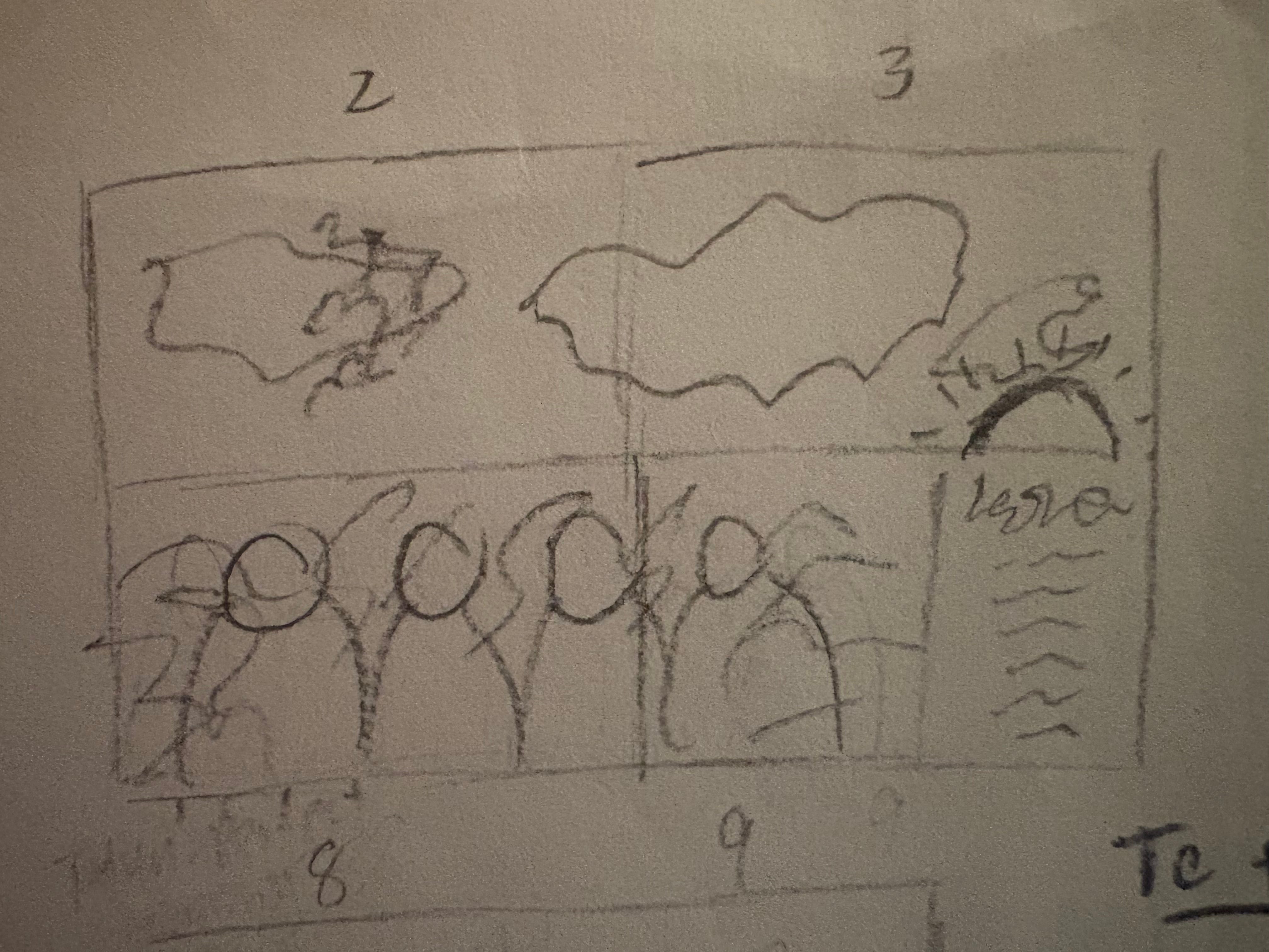
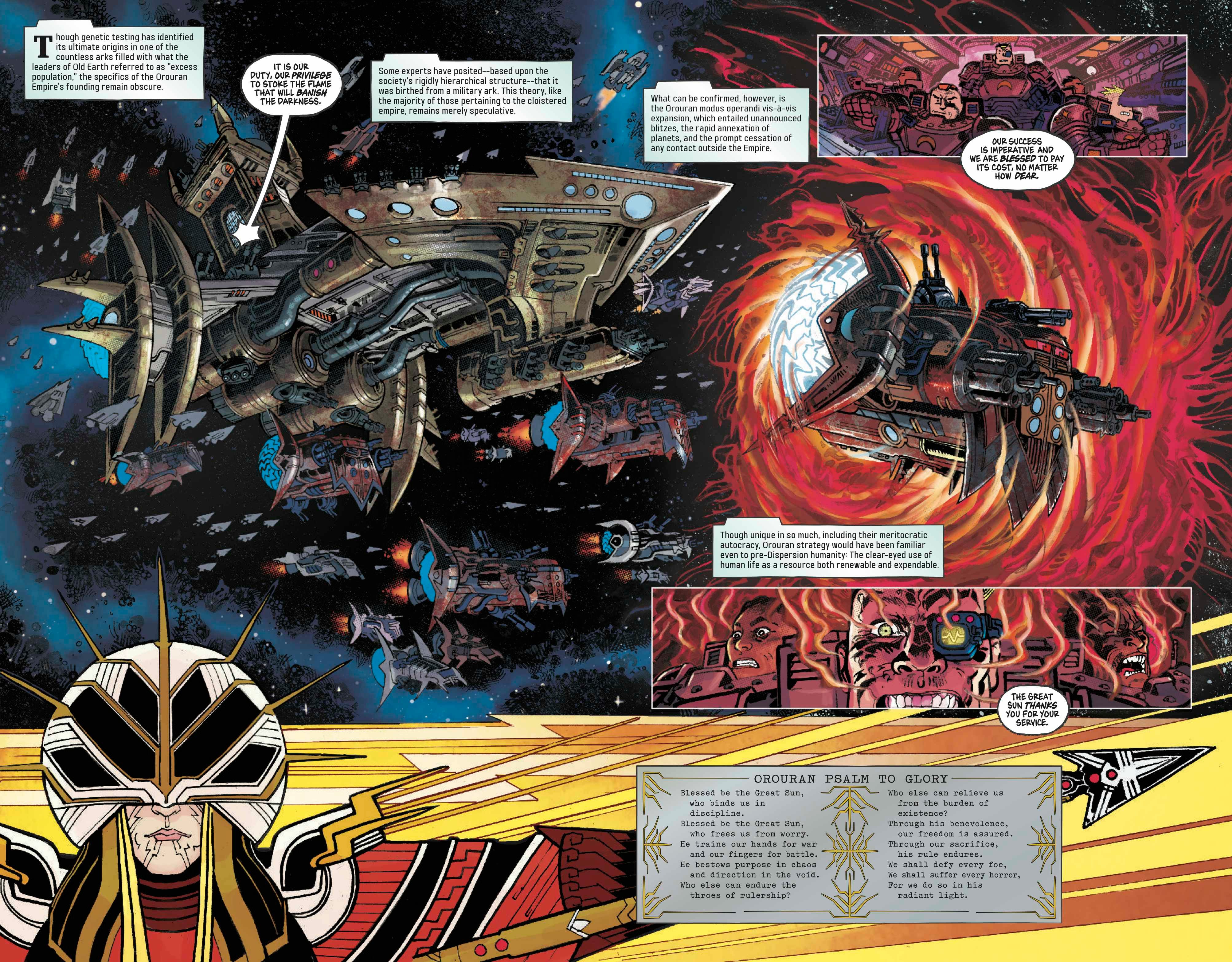
Even the most fantastic Free Planet spread begins with my chickenscratch thumbnails, which I do prior to scripting in order to force myself to conceive stories visually. Not infrequently, in the absence of complex panel progressions, I’ll endeavor to keep panel count as low as possible in order to provide my cocreator Jed Dougherty ample opportunity to enhance or add in additional beats. That is most definitely the case here with these scant three panels:
A wide shot of the Orouran fleet, with one ship in the midst of warp travel
A group of Orouran marines undergoing the warp agony
A breakout box containing an Orouran psalm adorned with the helmet of the Orouran leader, the Great Sun
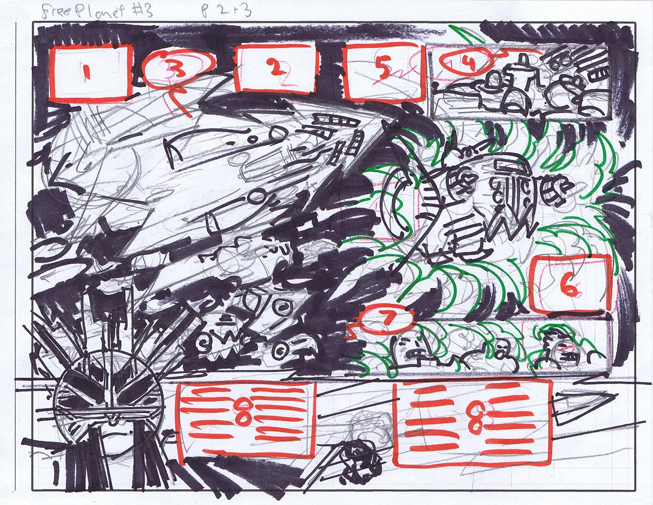
Unsurprisingly, Jed improved immeasurably upon my original idea, while also building the page not just in consideration of textual elements, but with them performing crucial compositional functions. Some notable adjustments:
The addition of two inset panels, one pre-warp, one mid-warp to help slow down the reader and better demonstrate the effects of the warp
The above also entailed a rearrangement of balloons/captions, which can be seen in the nonsequential numbering
Running the psalm horizontally, making a better use of space and helping to drag the reader’s eye back and forth across the page
Giving us a better, fuller view of the Great Sun in all his majesty
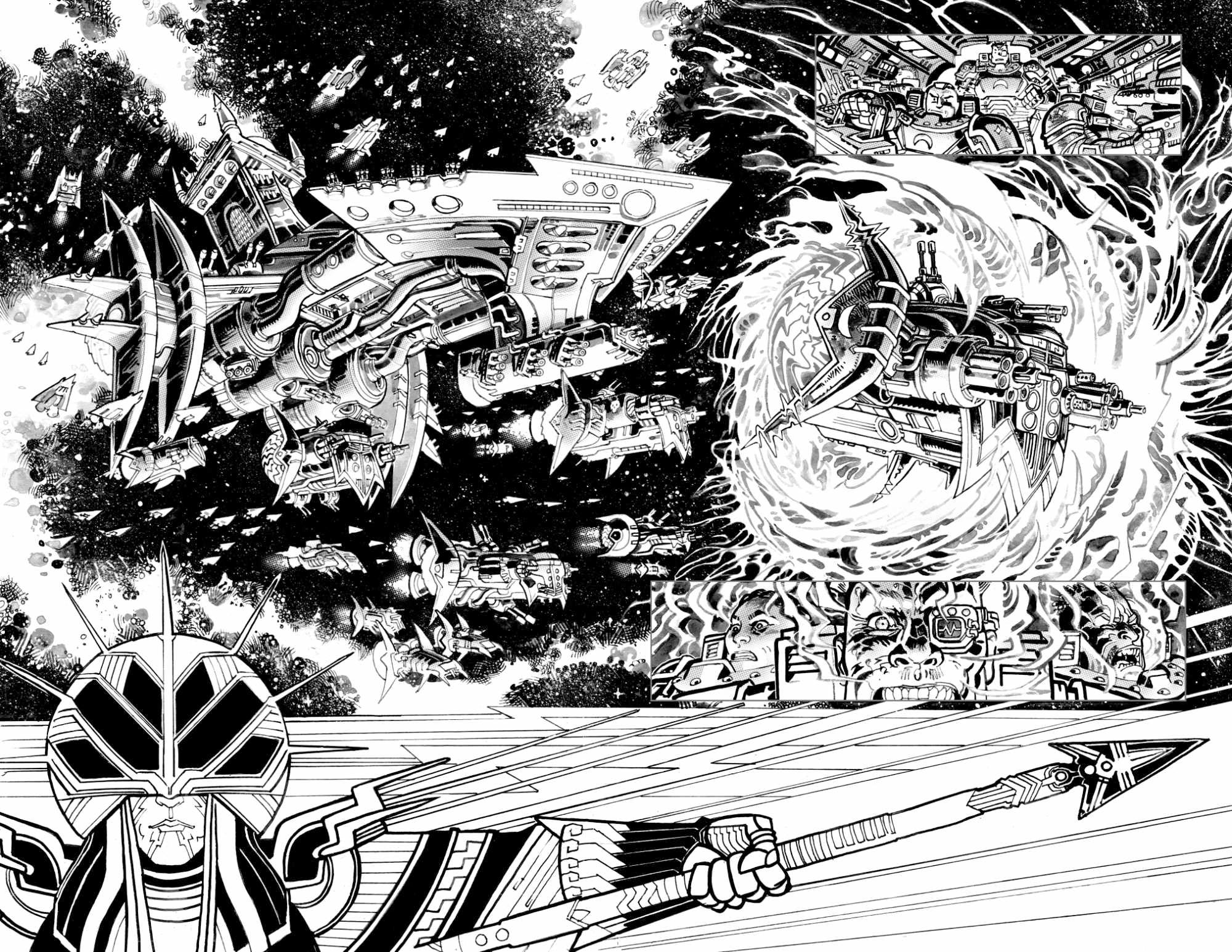
Jed’s inks hewed remarkably close to his layouts. The biggest adjustments include zooming in closer on the second inset, further heightening the perceived effects of the warp agony, and pulling further out on the Orouran flagship, allowing room for other ships and “space stuff.”
I always love looking at Jed’s inks, trying to pick out what’s traditional media, which textures are digital, and which elements may have been cobbled together in post. If you ever see Jed at a con, make sure to take a swing through his originals, which are even more fascinating in this regard, as they function less like a self-sufficient piece of art and more like blueprints for the real art object (the finished comic book, natch). It’s why he sold a page of Free Planet #2 more than a year before the book had even been announced!
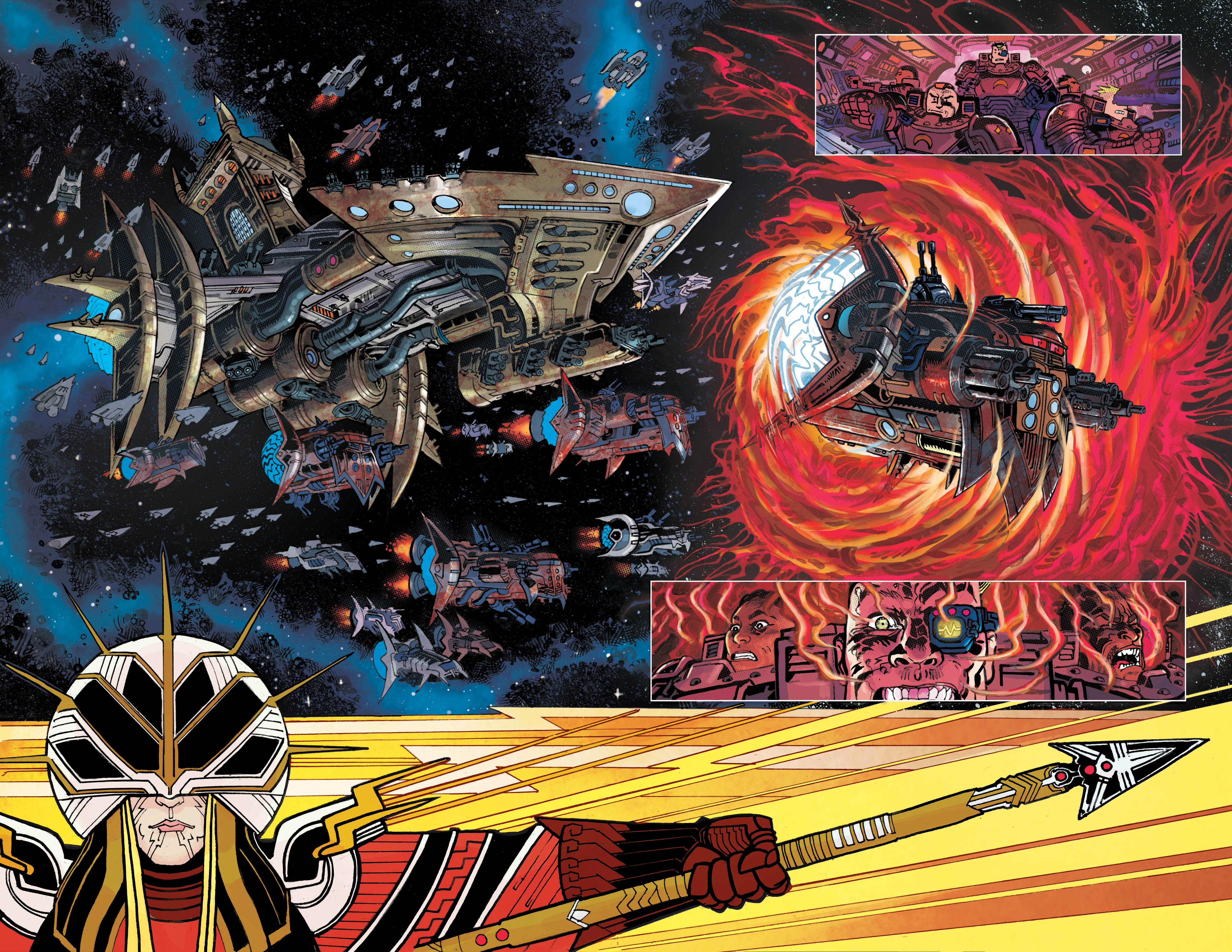
Vittorio Astone makes comic book coloring look deceptively easy. Here, he had to wrangle multiple effects that Jed layered into the page while also navigating my thematic coloring requirements and ensuring that the insets remain visible and that the Great Sun is appropriately magnificent.
Some particularly smart choices here include the white inset panel borders and Vittorio’s artful use of color holds, particularly on the warp effects and “space stuff.” He was also exceedingly patient with my requests for Orouran ships to be stained red from their time within the warp, which added additional levels of difficulty with regard to readability.
And, finally, Taylor Esposito pulls it all together with the lettering. Tweaks to placements were minor at this stage and mostly based around our trying to avoid covering up Jed’s figures. Prior to sending Taylor script, I always do a lettering pass, trying to trim and add where necessary, but – not infrequently – I pull the machete back out after Taylor’s first pass. At that stage, my intent is wholly aesthetic based, making sure captions are of the appropriate shape and don’t feature awkward orphans or stacking.
The biggest change from the placements was doing the psalm as a single wide image. I forget who made this call – Jed, Taylor or me – but the reasoning behind it was to have the psalm function as a single object as opposed to readers losing the rhythm between halves. In the element’s design, Taylor did an incredible job capturing the sense of a religious text while still adhering to Orouran aesthetics.
As always, I’d love to hear what you think about Free Planet in the comments. And, if you have questions about Lutherian history or the Free Planet universe, shoot them to DrAldousFoyroushi@AtlantisStillSunk.com for inclusion in a future issue!
Aubrey
Hoping to grab my copy this week! Might not because of a con, but I am pumped!
The Approach! It occurs to me I read this in PDF a long time ago, but have yet to experience it in print, as intended—even demanded.